Cute Keyboard: Sound & Emoji
- 4.3
- Rating
- 1.00M
- Installs
- Free
- Price
 Analysis by App-foxy
I spent time with Cute Keyboard: Sounds & Emojis as a daily typing replacement rather than treating it as a quick theme download. That distinction matters, because a keyboard sits under almost every message, search, note, and login. A cheerful design can make typing feel nicer, but it also has to remain comfortable when I am moving quickly. My overall impression is that this app from Neli Creative is best understood as a visual and audio personalization tool for people who want their keyboard to feel more playful without turning setup into a project.
The app belongs to the personalization category and is free to install, with optional in-app purchases ranging from $1.99 to $29.99 per item. It is rated for Everyone, runs on Android 9 or later, and the current version is 1.2.5. Its public reception is encouraging: it holds a 4.7 average from around 8.8 thousand ratings, while its reach has passed one million installs. Those numbers do not replace personal testing, but they do suggest that the cute-keyboard idea has found a sizeable audience.
Making the everyday keyboard feel more personal
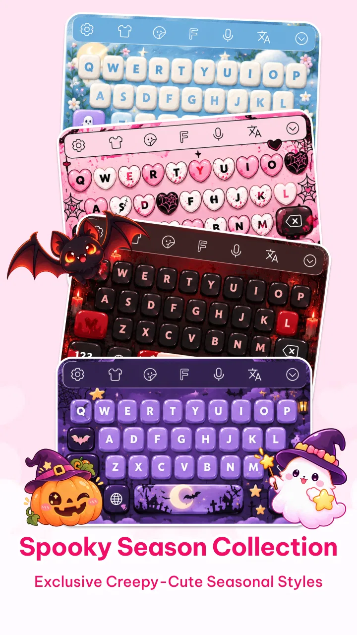
The first useful way to approach Cute Keyboard: Sounds & Emojis is to decide what I actually want to change. If I only need a reliable keyboard for long emails, rapid work messages, or multilingual writing, a conventional keyboard may remain the better fit. If I want a softer visual style, expressive emoji access, and optional keypress sounds, this app has a clearer purpose.
You May Also Like

 Blood Strike: 2.5 Anniversary
Blood Strike’s Loadouts Turn Every Drop Into a Tactical Gamble
A close look at Blood Strike’s custom loadouts: how fast access to signature weapons reshapes its battle royale rhythm, rewards preparation, and narrows the gap between fights.

 Pandora - Music & Podcasts
Pandora’s Music Is Easy to Start, but Harder to Recover
Pandora’s strength is its low-effort path from a seed to a station. Its weak spot is how much confidence it asks you to place in connection, setup, and quiet recovery.

 8 Ball Pool
 Is Built on Rivalries, Rematches, and Routine
A close look at the rivalries, rematches, shared routines, and unanswered safety questions that turn a quick pool match into a persistent mobile community.

 Samsung Music
’s Quiet Strength Is Playing What You Already Own
Its reach comes less from spectacle than from dependable access to a personal library. That simplicity is both the app’s strongest retention engine and its ceiling.

 AccuWeather: Weather Radar
AccuWeather Review: A Quick, Clear Forecast for Everyday Decisions
For everyday plans, the best forecast is the one you can understand quickly. AccuWeather makes rain timing, radar, and local conditions easy to act on, with a few trade-offs.

 Hill Climb Racing
Why Hill Climb Racing Still Turns Crashes Into One More Run
A tiny car, a bumpy hill and one more upgrade: Hill Climb Racing keeps resurfacing because its simple chaos makes every near-miss feel personal.
More From Our News Desk



My baseline workflow was simple: install the app, look through its available keyboard presentation, choose a style that was easy to read, and then use it in ordinary conversations instead of judging it from a preview screen. That last step is important. A theme can look adorable in a screenshot yet become tiring when the keys are small, the contrast is weak, or every tap produces more sound than expected.
I found the strongest use case in casual communication. Messages to friends, family group chats, social posts, and short notes benefit from a keyboard that feels expressive. The emoji emphasis also makes sense for users who communicate with reactions as much as words. The app is less compelling for someone who sees a keyboard as invisible infrastructure and wants the least noticeable interface possible.
There is also a practical emotional benefit. Personalization is not only about decoration; it can make a familiar routine feel less dull. I noticed that the visual treatment mattered most when I used the keyboard repeatedly throughout the day. A design that matches my phone’s wallpaper, icons, or general mood creates a more coherent experience than switching between unrelated system elements.
What I would check before settling on a theme
I recommend typing three different kinds of text before deciding that a theme works: a short message with emoji, a paragraph with punctuation, and a quick search containing numbers. This exposes problems that a simple “hello” test hides. Cute styling should not make the punctuation row difficult to identify, and sound effects should not distract when I am entering information in public.
Readability is more important than novelty. Bright colors, decorative keycaps, or low-contrast lettering may look charming at first but slow down touch typing. I would choose a theme with clear separation between keys if I often type without looking closely. For younger users or anyone with less precise tapping, visual clarity should take priority over the most elaborate design.
The emoji side deserves its own test. I would try opening the emoji area while writing a real message, then return to letters and punctuation several times. The useful question is not whether the app includes emojis in principle, but whether the transition fits my normal rhythm. If I constantly have to search for the same symbols, the decorative advantage may not compensate for the extra taps.
Settings that deserve a careful look
The keypress sounds are the setting I would examine first. They can make typing feel lively, especially for children or anyone who enjoys tactile-style feedback, but they are also the easiest feature to regret. In a quiet office, classroom, library, or shared room, audible feedback becomes a social nuisance very quickly. I would test it at the volume I normally use rather than assuming a pleasant preview level will remain pleasant during a long conversation.
My preferred habit is to treat sounds as situational rather than permanent. I can enjoy them when using the phone privately, then mute them before writing in public. If changing that option feels inconvenient, I would leave sounds off and keep the visual theme. That creates a calmer setup without giving up the main personalization benefit.
I would also spend time checking how the selected appearance affects ordinary keys. The most attractive theme is not automatically the best daily choice. Look for easy recognition of backspace, return, shift, and the number or symbol switch. These controls are used constantly, and a decorative layout that makes them blend into the background will create friction even if the letters remain readable.
Another useful check is whether the keyboard still feels comfortable after several minutes of continuous use. Short testing can hide visual fatigue. I would write a longer note, correct a few mistakes, add punctuation, and switch between letters and emoji. That workflow reveals whether the app supports my habits or merely looks good during setup.
Because the app is free to install but includes optional purchases, I would explore the no-cost experience before spending anything. The right question is whether the basic presentation already gives me the mood I want. A purchase may be worthwhile for someone who strongly prefers a particular style, but I would not pay simply because the first theme I see is not my favorite. The app’s value depends on how much personalization I will actually use every day.
Repeatable patterns for faster, less frustrating typing
Experienced use is less about tapping faster and more about reducing unnecessary decisions. I would pick one dependable theme and keep it long enough to build visual familiarity. Constantly changing the appearance makes the keyboard feel new, but it also removes the stable landmarks that help me type quickly. A consistent choice is especially useful when I switch between short replies and longer text.
I also recommend separating expressive messages from information-heavy typing. For a friendly chat, emoji and sound can be part of the experience. For addresses, appointment details, passwords, or work notes, I would prioritize clear keys and quiet feedback. This simple mental split prevents the playful design from becoming an obstacle when accuracy matters more than atmosphere.
A realistic daily scenario shows where the app works well. Imagine replying to a family group chat while commuting home. I might use the visual theme, add a few emojis, and enjoy a more personal feel than the standard keyboard. Later, when I need to enter a delivery instruction or write a longer message, I would mute sounds and pay closer attention to punctuation and corrections. The same keyboard can serve both situations if I make those choices deliberately.
Another helpful habit is to keep frequently used emoji in a small mental set instead of browsing endlessly. The app’s emoji focus encourages expression, but scrolling through every option can interrupt a conversation. I get more speed by using a few familiar reactions and only searching when the message genuinely calls for something more specific.
For users who type with one hand, I would judge the app by reach rather than appearance. Decorative keys do not solve the physical challenge of reaching the opposite side of the screen. If the layout or visual treatment makes edge keys harder to identify, the usual keyboard may be more efficient. Cute Keyboard is a better match for users whose priority is personality and comfortable casual typing, not maximum one-handed speed.
Where it differs from ordinary keyboard alternatives
The usual system keyboard tends to win on familiarity and low distraction. It is already integrated into the phone, generally feels neutral, and asks little from the user beyond typing. A dedicated emoji-focused personalization app offers something different: a stronger sense of style and a more noticeable response to each tap. I would choose the conventional option when I need a quiet, restrained tool, and this app when the keyboard itself is part of my phone’s personality.
Compared with a productivity-oriented keyboard, this app’s appeal is not about turning typing into a research or writing workstation. I would not select it expecting advanced text management, professional composition tools, or a work-focused interface. Its strength is narrower and clearer: making everyday messages more cheerful through themes, emoji access, and optional keypress sounds.
That narrower focus is actually useful. Apps that try to cover every typing need can feel crowded. Here, the decision is easier: do I want a cute keyboard experience, and does the chosen design remain practical? If yes, the app earns its place. If I am searching for specialized writing assistance, the standard or productivity alternative may be a better investment of attention.
The limits I noticed before recommending it
The biggest trade-off is that decoration can compete with function. A theme may encourage me to look at the keyboard more often, but visual detail is not automatically helpful. Anyone who types quickly by muscle memory may prefer a plain layout because it disappears beneath the fingers. This app is not the right choice for people who dislike animated, colorful, or expressive interfaces.
Sound is another clear boundary. Keypress audio can be fun in private and irritating everywhere else. Even when the effect is individually pleasant, repeated taps can become tiring over a long message. I would consider sound a bonus rather than a reason to keep the app installed. The visual customization needs to stand on its own when audio is unsuitable.
There is also a learning curve whenever I replace a familiar keyboard. The first few sessions may feel slower because my eyes are adjusting to a new appearance and my fingers are learning where controls stand out. That is not necessarily a defect, but it means I would avoid changing keyboards immediately before an important task. Give the new layout ordinary, low-pressure use first.
Finally, optional purchases require restraint. The free starting point makes experimentation easy, but a large collection of styles can encourage impulse spending. I would decide on a budget before browsing extras and only buy a design I expect to keep. For many users, the free experience may be enough; for others, the appeal is precisely in collecting a more distinctive look.
Who should install it, and who should skip it
I would recommend this app to Android users who enjoy matching their phone’s interface to their personality, regularly use emojis, and want typing to feel more playful. It is especially suitable for casual messaging, younger users, themed home screens, and anyone who finds a little visual charm motivating during repetitive phone tasks. The Everyone age rating also makes it approachable for a broad audience, although individual comfort with sounds and decorative designs still matters.
I would be more cautious about recommending it to writers, students, customer-service workers, or anyone who spends long periods entering precise text. Those users should test readability and correction speed carefully before switching. If a neutral keyboard already feels fast and comfortable, the benefit here may be mostly cosmetic, while the adjustment cost is real.
I would also skip it if I want a keyboard that stays completely out of the way. The app’s identity is built around noticeable personalization. That is its reason to exist, but it is also the reason it will not suit everyone. People who prefer minimal interfaces, silent feedback, or a highly utilitarian workflow may be happier with the keyboard already included on their phone.
My final view after building a routine around it
Cute Keyboard: Sounds & Emojis succeeds when I use it intentionally rather than expecting decoration to improve every form of typing. I get the most from it by choosing a readable theme, testing punctuation and emoji switching, keeping sounds for private situations, and resisting the urge to change styles constantly. Those habits make the playful elements feel useful instead of distracting.
The app from Neli Creative is free to try, supports Android 9 and newer, and has enough personality to stand apart from a standard keyboard without pretending to be a full productivity replacement. Its optional purchases mean I would explore first and spend later. The current version, 1.2.5, gives it a straightforward starting point for anyone curious about a cuter interface.
My recommendation is positive, with a practical condition: choose it for personality, then judge it by accuracy. If the keys remain easy to read and the emoji workflow fits your conversations, this is a pleasant way to make a routine part of phone use feel more like your own. If you need silent, distraction-free, highly efficient typing above all else, the ordinary keyboard remains the smarter choice.
FAQs for Cute Keyboard: Sound & Emoji
01What features does Cute Keyboard: Sounds & Emojis offer?
Cute Keyboard: Sounds & Emojis provides a wide variety of features that enhance typing experiences. Users can choose from numerous themes, add sound effects to keystrokes, and access an extensive library of emojis and GIFs. The app also supports multiple languages and offers predictive text to improve typing speed and accuracy.
02Is Cute Keyboard: Sounds & Emojis safe to use?
Yes, Cute Keyboard: Sounds & Emojis is designed with user privacy in mind. The app does not collect personal data or store keystrokes. However, as with any app, it is essential to download it from a trusted source like the official Google Play or Apple App Store to ensure security.
03Does Cute Keyboard: Sounds & Emojis consume a lot of battery?
While any app running on your device will consume some battery, Cute Keyboard: Sounds & Emojis is optimized to minimize energy usage. Features like sound effects and animations might slightly increase battery consumption, but users typically find it manageable. Adjusting settings can further enhance battery efficiency.
04Can I customize the themes and sounds in Cute Keyboard: Sounds & Emojis?
Absolutely! Cute Keyboard: Sounds & Emojis offers extensive customization options. Users can select from a variety of themes and sound effects to suit their preferences. The app allows for personalization, enabling you to create a unique typing experience tailored to your style.
05Is Cute Keyboard: Sounds & Emojis compatible with all devices?
Cute Keyboard: Sounds & Emojis is compatible with most Android and iOS devices. It requires a minimum operating system version, which is typically listed on the app’s download page. It is advisable to check your device's compatibility before downloading to ensure optimal performance.
Pros
- Wide variety of cute themes available.
- Customizable sound effects for keys.
- Easy-to-use interface and setup.
- Supports multiple languages seamlessly.
- Regular updates with new features.
Cons
- Contains ads that can be intrusive.
- Limited free themes; many require purchase.
- Some themes drain battery quickly.
- Occasional lag on older devices.
- Privacy concerns with data access permissions.

Cute Keyboard: Sound & Emoji
Gallery